
1
Chevron
Photoshop, Lightroom Classic, Illustrator, Firefly
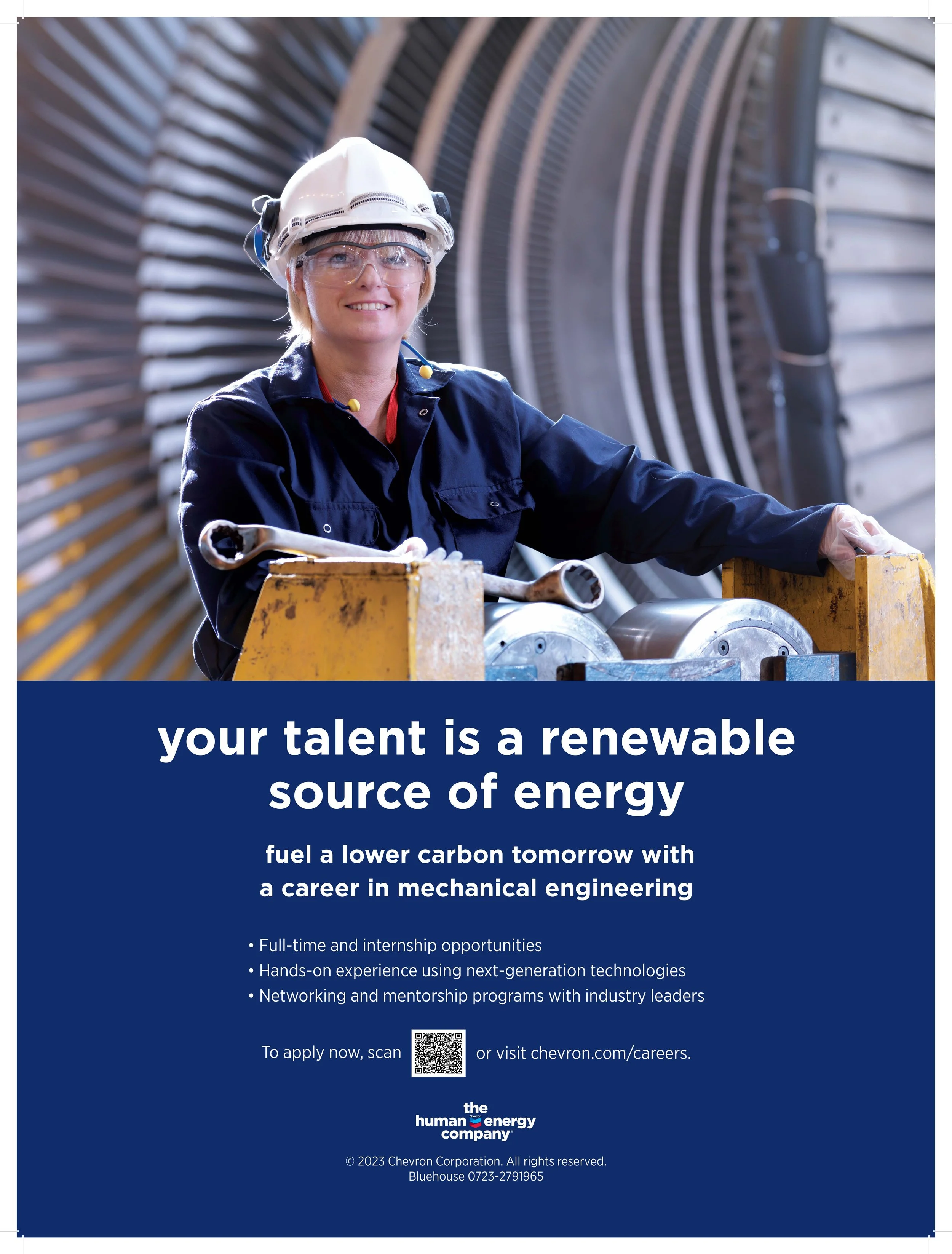
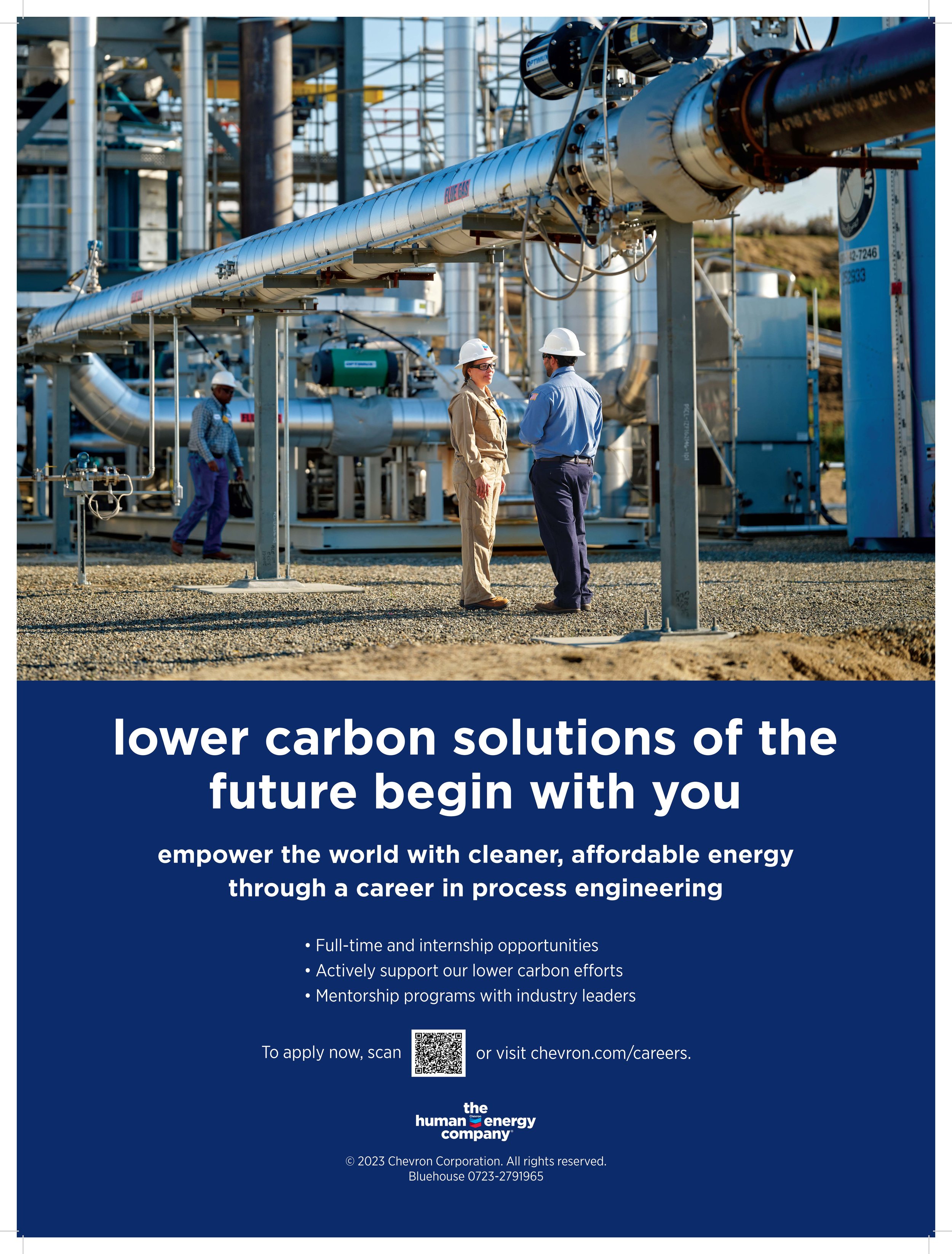
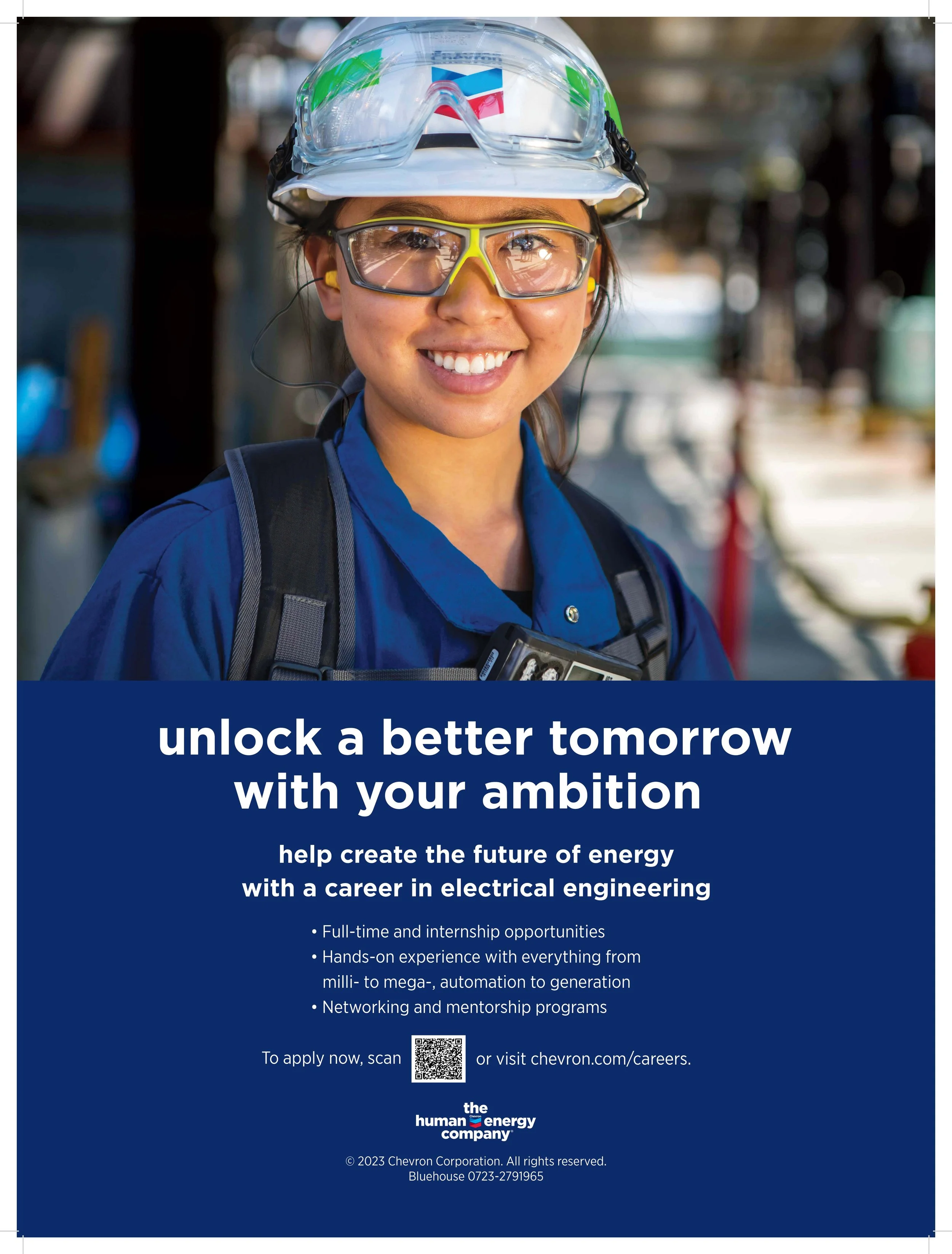
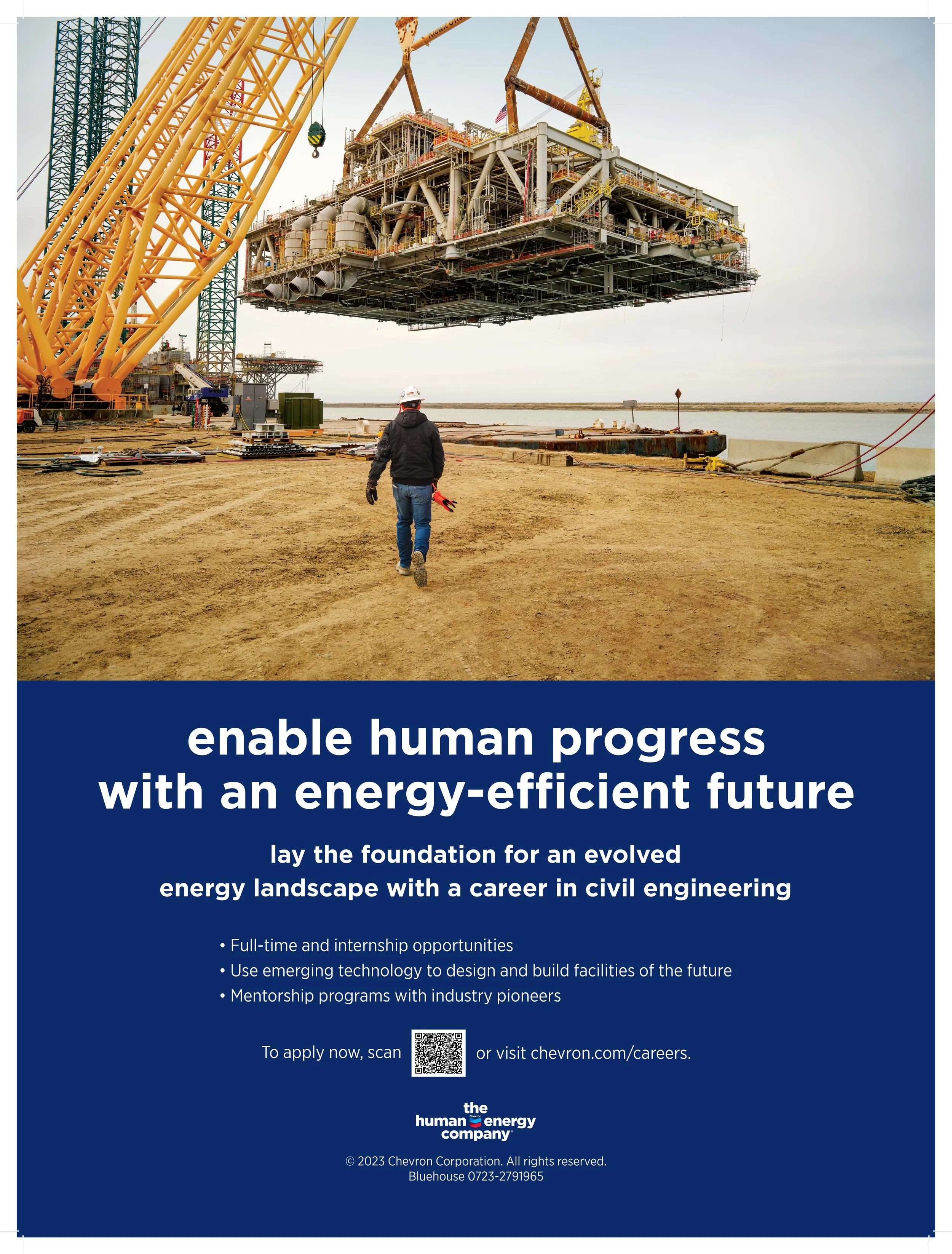
Art directed and designed a premium recruitment campaign consisting of four campus posters targeting elite science and engineering universities, including MIT. The campaign positioned Chevron as an innovative technology leader through aspirational visual storytelling and high-end production.
To modernize Chevron's legacy photography, I developed an AI-assisted retouching workflow using Adobe Firefly and Photoshop, removing environmental distractions, restoring equipment, and refining imagery to meet contemporary brand standards while preserving authenticity.


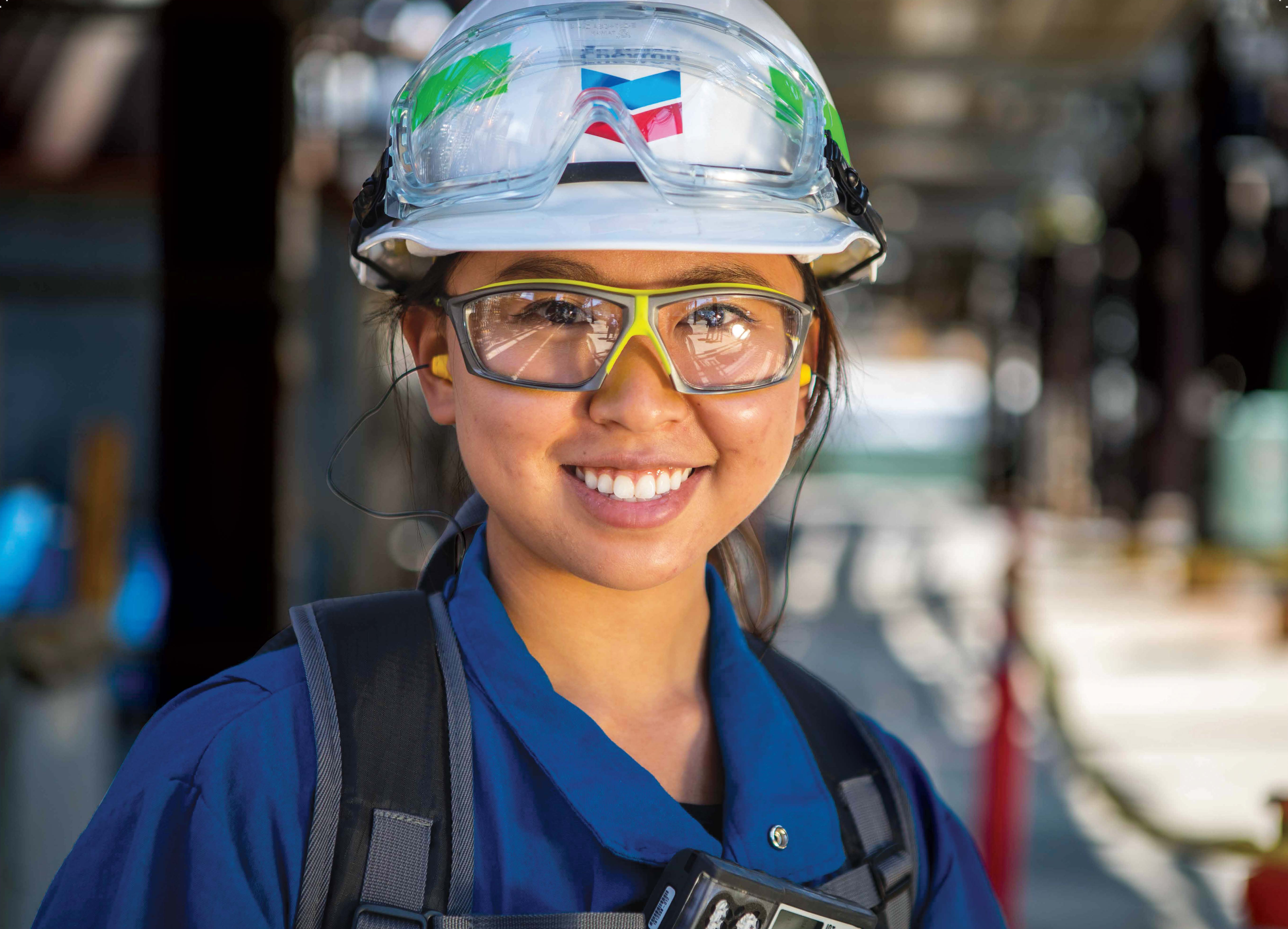
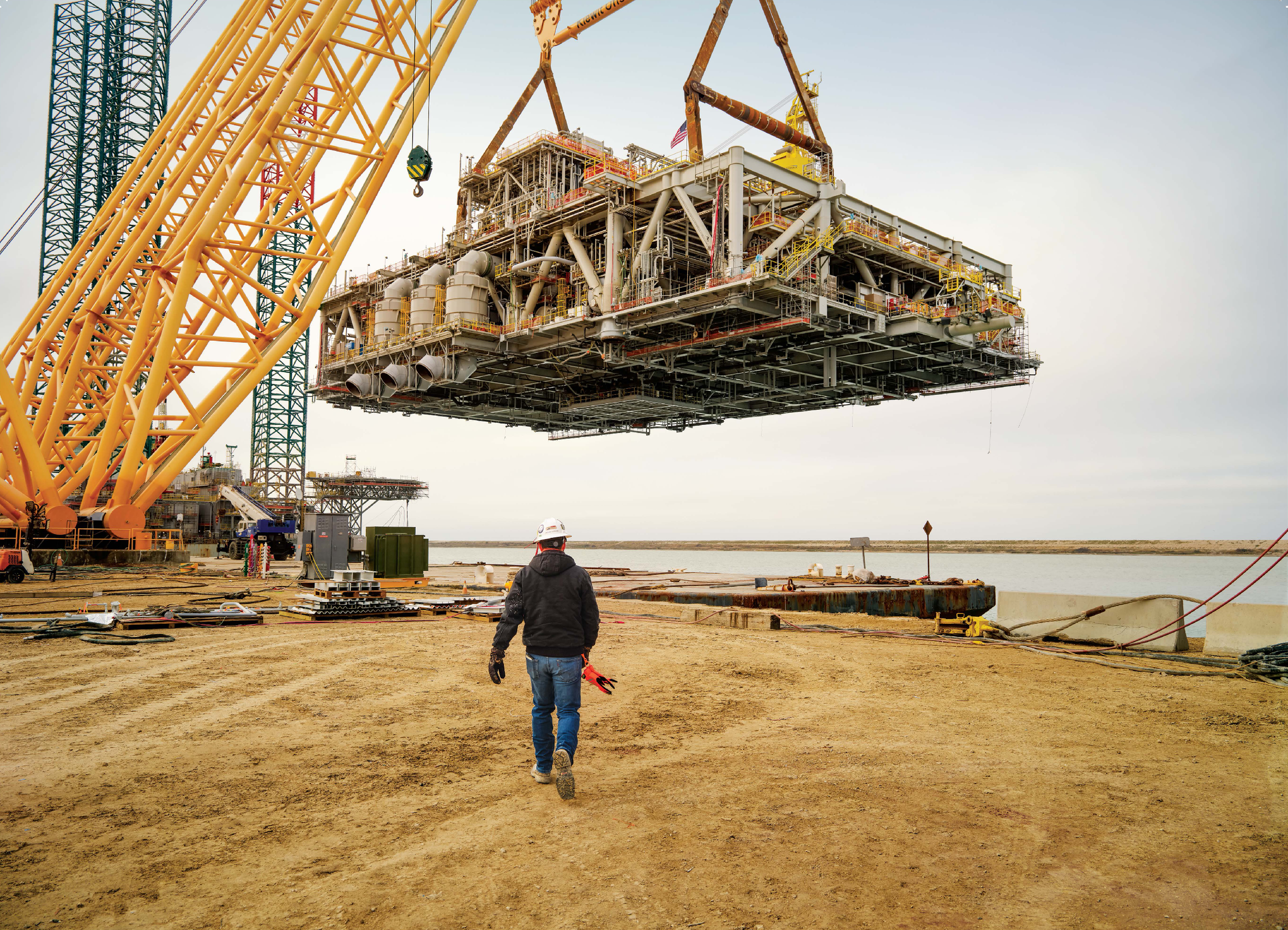

By balancing authentic human engineering photography with targeted copy, I created a set of large 18" x 24" posters designed to stand out among a sea of competing recruitment materials.
Utilizing high-end digital finishing and generative cleanup, I ensured that the final print assets felt grounded, clean, clear, and polished alongside any surrounding campaigns
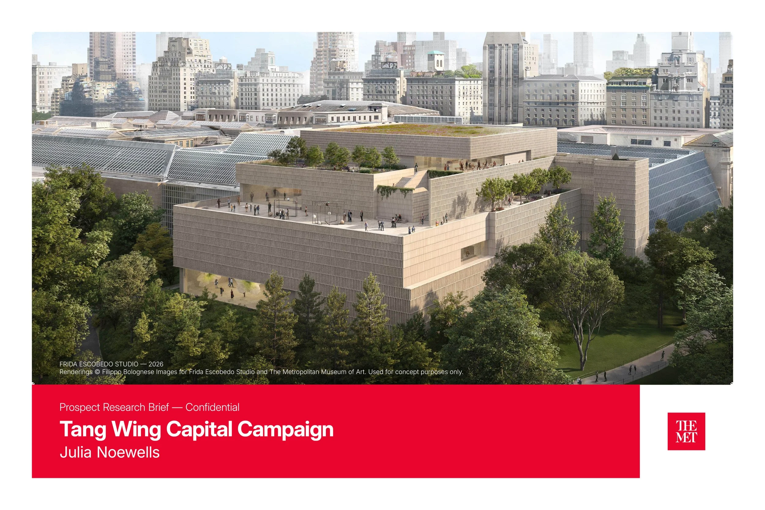
2
The Metropolitan museum of Art
Photoshop, InDesign, Claude Designer, Firefly
A personal concept series imagining custom water bottles, out-of-home advertising, and a prospect research brief for The Metropolitan Museum of Art.
Each water bottle pairs a single word with a work from the Met’s permanent collection — designed to reflect the emotional experience of wandering the galleries while encouraging visitors to pause and hydrate. The mockups are set within a baroque-inspired environment that echoes the atmosphere of the museum itself.
The billboard concepts extend the same sensibility into public space, from a subway campaign welcoming visitors to a street-level campaign announcing the Tang Wing for Modern and Contemporary Art, designed by Frida Escobedo and opening in 2030.
The project also includes a speculative prospect research brief developed for the Tang Wing campaign, exploring how editorial design and donor strategy materials can support institutional fundraising efforts.
Rest
The Love Song — painting by Sir Edward Burne-Jones
British, 1868–77
A woman lost in quiet repose, her world narrowed to a single peaceful moment. A gentle reminder to slow down and rest as you travel through the many halls and galleries of The Met.
Refresh
Originally painted by James E. Buttersworth and redrawn by Charles Parsons for Nathaniel Currier in 1854, The Yacht "Henrietta" captured a moment of pure momentum — wind, water, and forward motion.
That same energy, now in your hand.
The Refresh water bottle series pairs iconic works from the Met's permanent collection with a single word.
Refresh.
Enchant
The Love Letter — painting by Jean Honoré Fragonard
French, 1700s
Rest, refresh, and always enchant.
Billboards
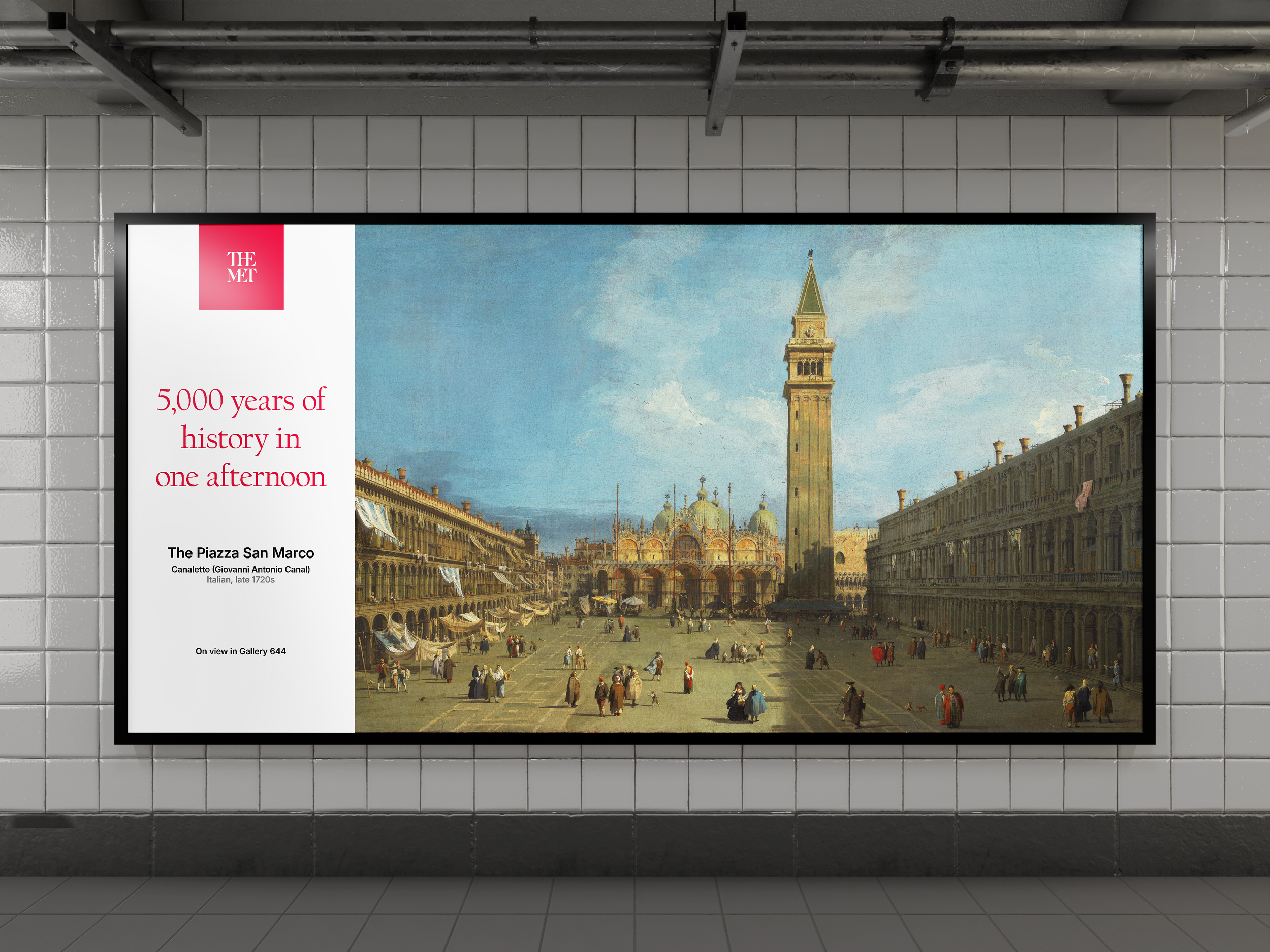
Subway Billboard
The Piazza San Marco — painted by Canaletto
(Giovanni Antonio Canal)
Italian, 1720s
Paintings from Venice. Sculptures from Rome. Jewelry from ancient Egypt. All of it — right above you.
5,000 years of history in one afternoon.
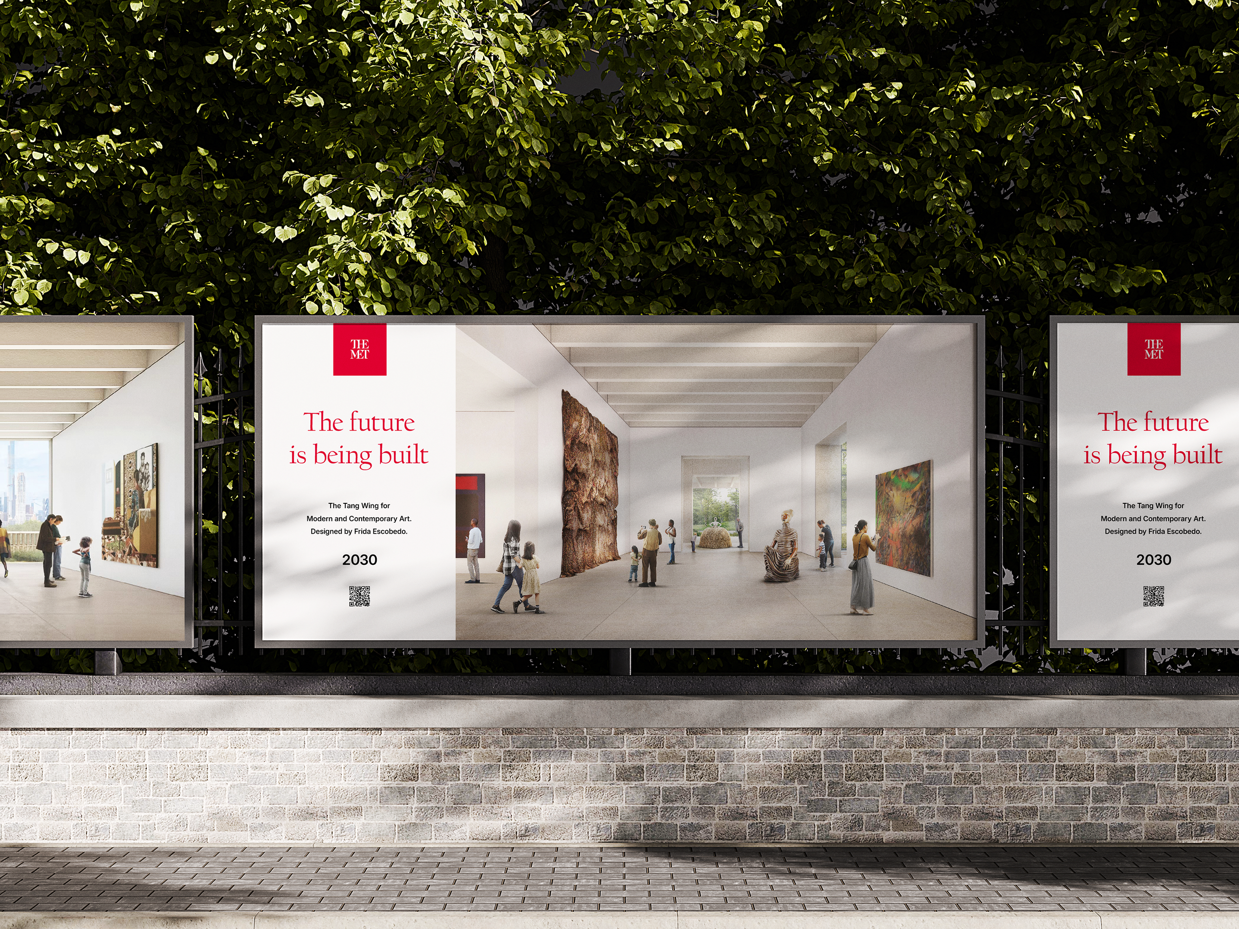
Street level Billboard
A new home for modern and contemporary art. Breaking ground 2026. Designed by the first woman in the Met's 154-year history. 126,000 square feet. Opening 2030.
The future is being built.
Renderings © Filippo Bolognese Images for Frida Escobedo Studio and The Metropolitan Museum of Art. Used for concept purposes only.

Prospect Brief
A mock prospect research brief developed for the Metropolitan Museum of Art's Tang Wing capital campaign.


3
Photography and Retouching
Nikon, Photoshop, Lightroom Classic
This section showcases a combination of my original location photography and high-end digital retouching. I guide the visual pipeline from initial art direction—including location scouting, wardrobe, and styling—to precision post-production and color grading. Whether capturing the frame on location or executing complex digital finishing on existing imagery, the final assets are refined for social media, portfolios, campaigns, and editorial design.


4
Genentech
Photoshop, Illustrator
“LUV Your Skin” Logo and Outdoor Campaign – Clio Award Winner
LUV Your Skin Campaign
I proposed incorporating light-reactive ink into the outdoor signage for Genentech's "LUV Your Skin" campaign. We printed the campaign messaging on outdoor benches and tables across the corporate campus, allowing the ink to react to sunlight and reveal different messages based on exposure.
This innovative approach added an interactive and dynamic touch to the campaign's outdoor branding.
LUV Your Skin Campaign Logo
The heart icon symbolizes “LUV,” while the embedded letters UV subtly reference ultraviolet light—highlighting both the risks of UV exposure and the importance of protecting your skin. The logo blends these dual meanings into a simple message: love your skin and protect it.
The campaign was later recognized by the medical marketing industry and appeared in MM&M magazine’s “Top 100 Agencies” issue, where the Genentech work was featured as part of the publication’s annual overview of leading agencies in healthcare marketing.
6
Genentech
ASCO Convention Booth Design- Agency Award Winner
3DS Max, Photoshop, Illustrator
I was part of the team that designed Genentech’s “World of BioOncology” convention booth for ASCO. The team included the Managing Director, the V.P. Creative Director, the Director of Technology, and the Director of Client Services.
As part of the creative team for Genentech's ASCO convention booth, I co-developed the architectural canopy concept and designed the storyboards for the motion animations displayed across the massive overhead digital installation shown below.
Additionally, I designed the visual layouts and interactive user activities featured on the multi-touch digital panels located throughout the environment.


